When I started using Procreate, I had zero experience with digital media. Which dpi was considered “hi-res”? Which color profile to use? How large to make the canvas? What the heck the layers were all about? I spent far too long trying to figure it all out on my own. But for those of you who are still unsure about some of these things and you just want to start playing in Procreate, this post is for you!
Creating a Canvas
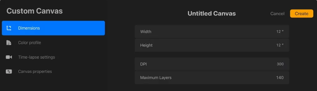
This is a raster program, not vector, so things pixelate if you shrink them way down or upscale much bigger than the size you initially drew. When you create a new canvas, use the physical dimensions that are about the size you might want to use it for (are you printing it on a large paper maybe?) and if you can make it a bit larger, do! I usually make something that is a common print size in the US, like 11” x 14”. And when I make seamless patterns, I make a 12 inch square canvas. And 300 dpi is considered high resolution! As of now, early March 2025, the number of layers you will get is determined by the dimensions, dpi, and the amount of memory that is on your iPad (not storage, but RAM). Very soon, Procreate will have an update that is likely to change this so we don’t have to worry about layer limits! I’ll post about that when it happens.
Color Profile
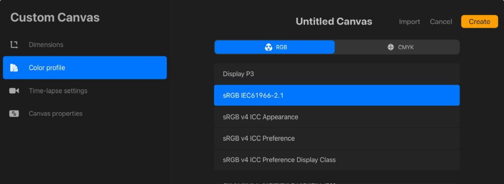
Color Profile is a large, evolving topic and I am no expert so this is just what I do. Procreate defaults to Display P3 which is a profile that is best viewed on Apple devices, it’s highly saturated. The sRGB profile directly under that is commonly used on other apps and is a common profile for print as well (yup, you don’t always have to use CMYK to print)! If you are bringing your work back and forth between apps, like Affinity Designer for example, you will want matching profiles. I stick with this one for absolutely everything. But if you end up working with clients or publishers, you will want to discuss this with them. Oh, and if you ever have a Spoonflower shop, this is also the profile they use!
Layers
As far as layers go, think of them like a stack of clear glass with paint on each one. If you have a big blue dot of paint on a layer that’s “above” a layer that has a small red dot on it, the blue dot will hide the red dot. If the red dot is moved over to one side or the other (or the blue layer is turned off) then you can see it! Also, you can’t smudge those two colors together when they are on different layers!
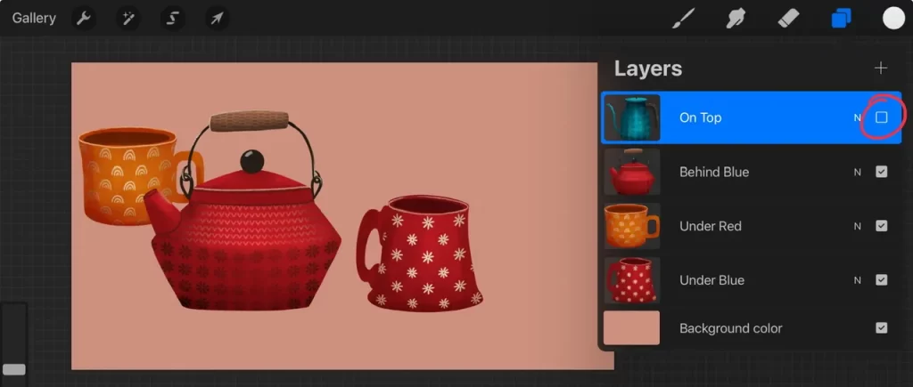
Below, these two pots are overlapping a little, the blue pot is on a layer above (higher than) the red pot so it’s “in front of” the red pot. Now, what if I told you there are two mugs in this painting as well? They are behind these two pots and since they are smaller, they can’t be seen! They are on “lower” layers.
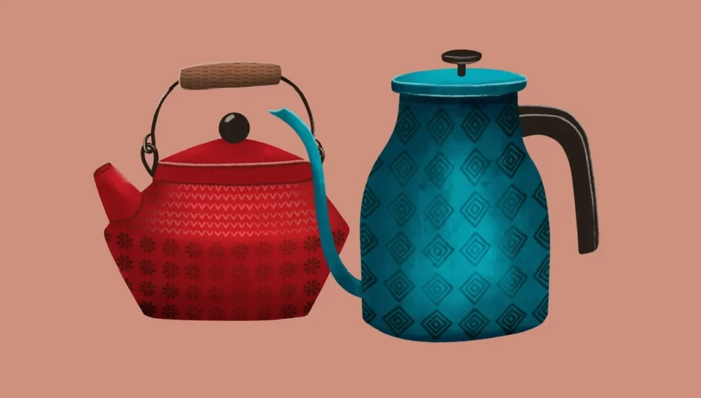
See the layers! The mugs are completely hidden!
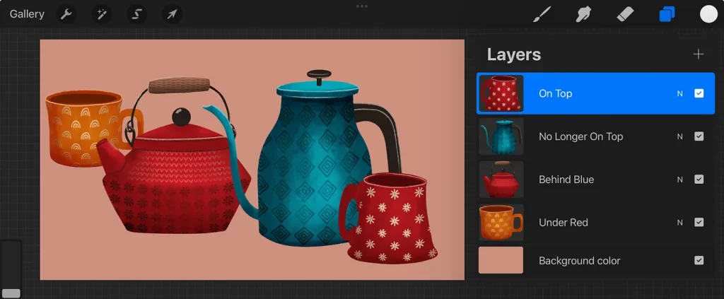
In the next image, the orange mug has been moved up and to the left. You can see it now because of its position on the canvas even though it’s still on a lower layer. And by unchecking the box on the right, the layer that has the blue pot on it is off so you can see the red mug.
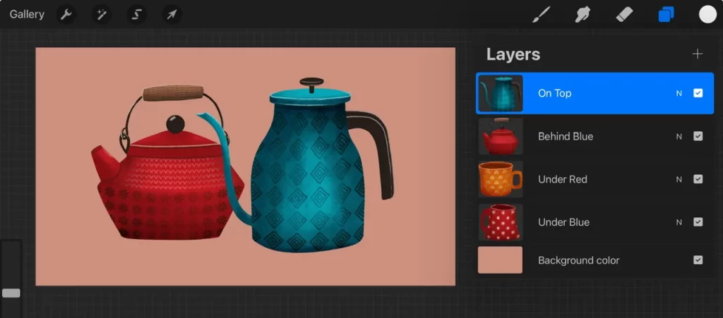
You can also rearrange layers by dragging them! You can see I turned the blue pot layer back on. But I’ve put the red mug on the highest layer (and moved the mug’s position on the canvas). It is “in front of” or “on top” now, the highest layer.
Time to Study
That was a simplified explanation of the layers. When I created each pot and mug, I used multiple layers for each one! But you can also merge them together so that’s what I did to show the above examples. Below, you can get an idea of how complicated layers can get in a full illustration. I’ve grouped multiple layers together for each part of the illustration. And the order of those groups is determined by what needs to be “in front of” other things. Take a bit of time to look at the order of each layer-group so you can understand why they are in this order. Sometimes it doesn’t matter, like the mushroom group could be much higher on the list since it doesn’t overlap with anything.

Layers are important to understand but also know that you can treat it like you’re painting on paper and try to use just one layer! Using fewer layers helps you achieve a less digital look too!
Brushes
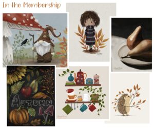
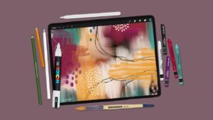
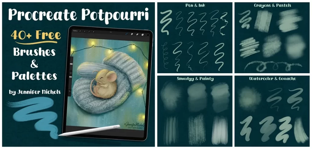
Finally, a quick note about brushes and the Apple Pencil. You can select a wide variety of “brush looks” to paint, smudge, or erase with. It’s a good idea to experiment with them all! What do they look like on small sizes, larger sizes, smudging colors together, etc. You can also learn to make adjustments to brushes or make some that are entirely new! In fact, I have a free set for newsletter subscribers that you can see pictures of below. It’s a great example of how different each brush behaves. These are some of my favorite brushes!
The Apple Pencil is the only stylus that has pressure sensitivity in Procreate, meaning you can paint thicker, darker, wider strokes with heavier pressure, and faint strokes with lighter pressure. If you aren’t using one, you won’t have the best experience in this app (and be aware, there is a “cheap” version of the Apple Pencil that doesn’t have the ability to use pressure so avoid that one).
I hope this gives you a little jump start with understanding Procreate. There are so many things to learn and I can’t possibly do that in a post. I do have a free course that you might like. I’m so excited about how much art Procreate has brought back into my life that I want everyone to experience it! Be sure to enjoy the journey though, like most things, it takes time and practice.
Enjoy! -Jennifer Nichols